
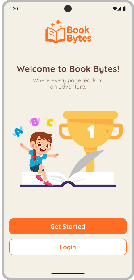
Book Bytes: Tales That Spark
Book Bytes: Tales That Spark
Designing a reading app that grows with kids
Designing a reading app that grows with kids

Book Bytes: Tales That Spark
Designing a reading app that grows with kids
Duration: September - April 2025 (7 months)
Team: 1 UX Designer, 1 Product Manager, 4 Developers, and 1 Content Strategist
My Role: UX Designer
Result: Increased story completion rates and reduced onboarding drop off.
Result: Increased story completion rates and reduced onboarding drop off.
Duration: September- April 2025 (7 months)
Team: 1 UX Designer, 1 Product Manager, 4 Developers, and 1 Content Strategist
My Role: UX Designer
Result: Increased story completion rates and reduced onboarding drop off.
PROBLEM
Kids Got Lost. Parents Were Locked Out
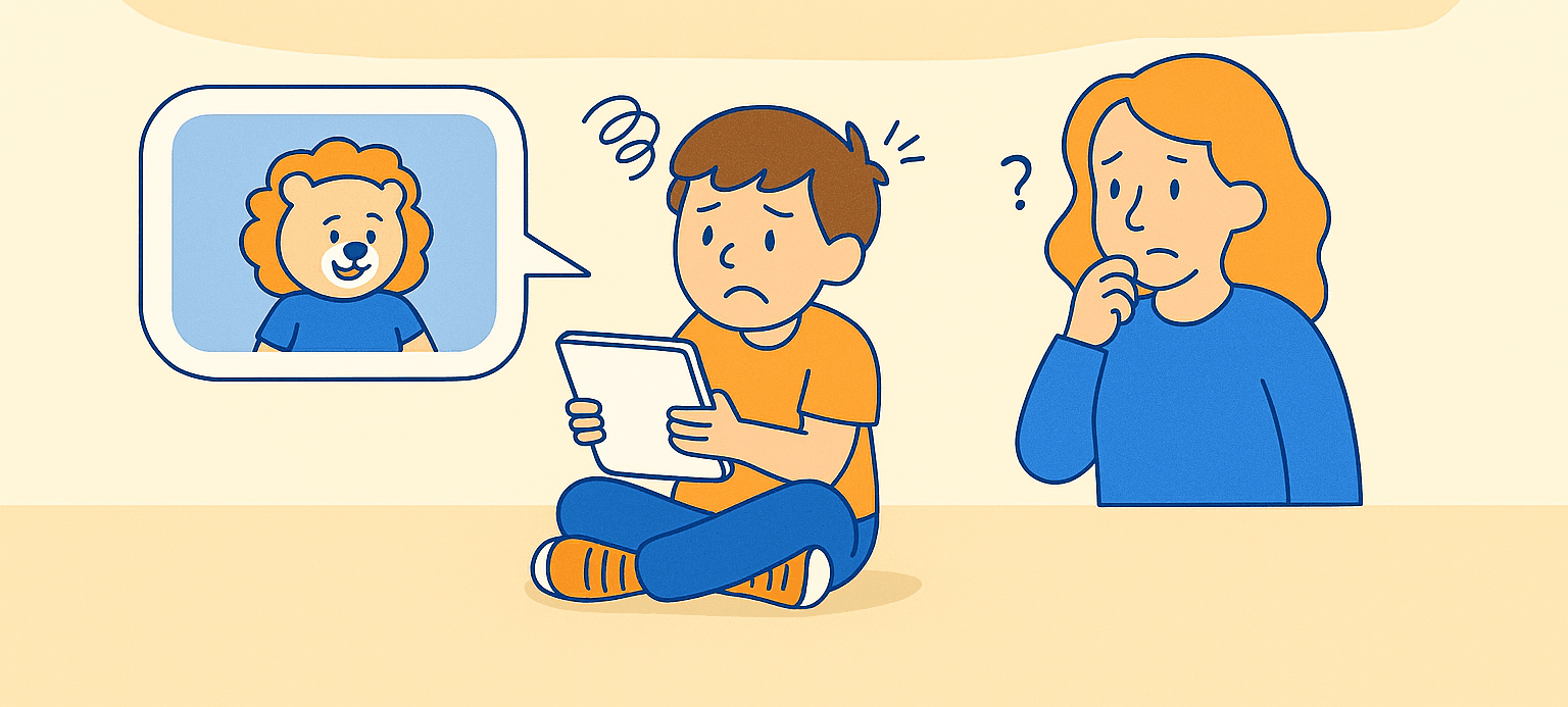
Book Bytes started as a desktop platform not tailored for young children reading independently. When we explored how early readers (ages 5–10) used it, we noticed a pattern: they arrived excited but quickly disengaged. Many couldn’t recall where they left off, didn’t receive feedback after finishing a story, and struggled to feel a sense of progress.
For this age group, confidence is fragile. Even small barriers can break momentum. Their grown-ups, eager to support, had no tools to stay informed without hovering or taking over — the very things they hoped to avoid.
We asked: How might we design a mobile reading experience that nurtures kids' confidence while keeping grown-ups gently in the loop?
RESEARCH APPROACH
Who we spoke to:
👩👧 3 parent interviews about digital reading habits and expectations
🧒 3 play-based usability sessions with kids (ages 6–9)
🧠 1 stakeholder workshop to align constraints and success criteria
4 out of 5 kids tapped icons expecting to “get something”
3 of 5 forgot where they left off
All 3 parents wanted visibility without disrupting their child’s experience
What we found:
Grounding Design in Real Behavior, Not Assumptions

We used a small, mixed-methods approach to evaluate both how early and developing readers (ages 5-10) interact with digital stories and how parents support them. Our goal was to uncover friction points, motivation gaps, and opportunities to reinforce autonomy
FROM INSIGHT TO INTERFACE

This table became a design compass that kept user motivation, clarity, and independence at the forefront.
Kids Wanted Rewards. Parents Wanted to Disappear.
Our research surfaced distinct patterns in expectations and frustrations. We mapped these into actionable design choices:
DIFFERENTIATING THE EXPERIENCE
We audited three early literacy apps — Epic!, Reading.com, and Kids Books — to understand how they motivate children, support autonomy, and balance adult involvement. This competitive analysis helped us identify design patterns to borrow from and intentional gaps to fill.
While all three competitors offered engaging, colorful interfaces and curated content libraries, they often relied on gamified triggers to drive engagement. Book Bytes shares some familiar visual and interaction patterns but was designed with a fundamentally different motivation model: one focused on internal pride and effort, not points or pressure. We deliberately departed from this norm by building motivation around effort-based feedback and visual encouragement rather than simulated progress.

These friction points highlighted clear gaps in the market. We used them to guide design decisions that prioritized autonomy, clarity, and quiet support, rather than replicating gamified systems.
Most Kids’ Apps Reward Clicks. We Chose Confidence.
“Sparks felt like a high five, not a test.” – Parent


FEATURE PHILOSPOHY
Confetti and sparkle animation guides kids to tap "My Sparks"
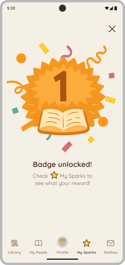
🎉 Celebration screen
Motivation That Celebrated Effort, Not Points
Where other apps leaned on stars and streaks, we asked: what if kids didn’t need to win something to feel proud of reading? We wanted kids ages 5–10 to feel proud of progress, not pressured by performance. Each feature was paired with microinteractions that emotionally affirmed effort, not comparison.
✨ My Sparks
Encouraged habit, no penalties for breaks
Visual feedback tied to milestones, not scores
Recognized effort, not comparison
Confetti and sparkle animation guides kids to tap "My Sparks"
🎉 Celebration screen
UX PATTERN
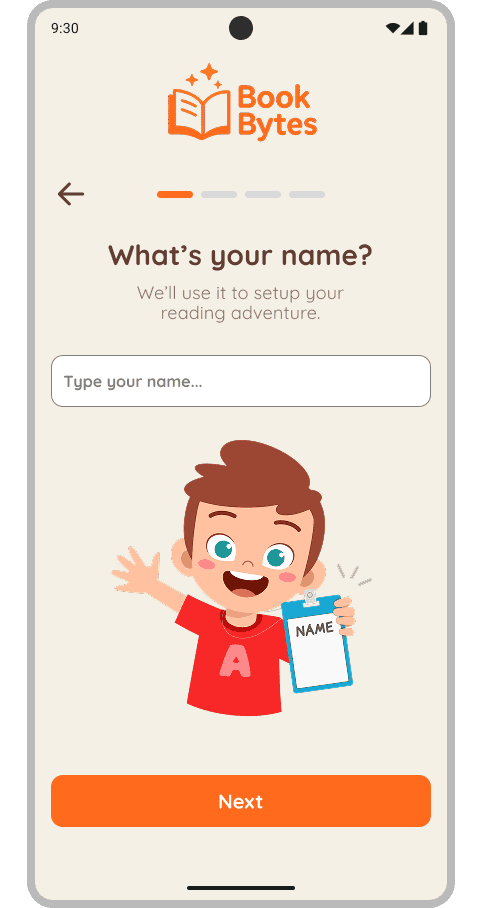
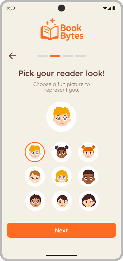
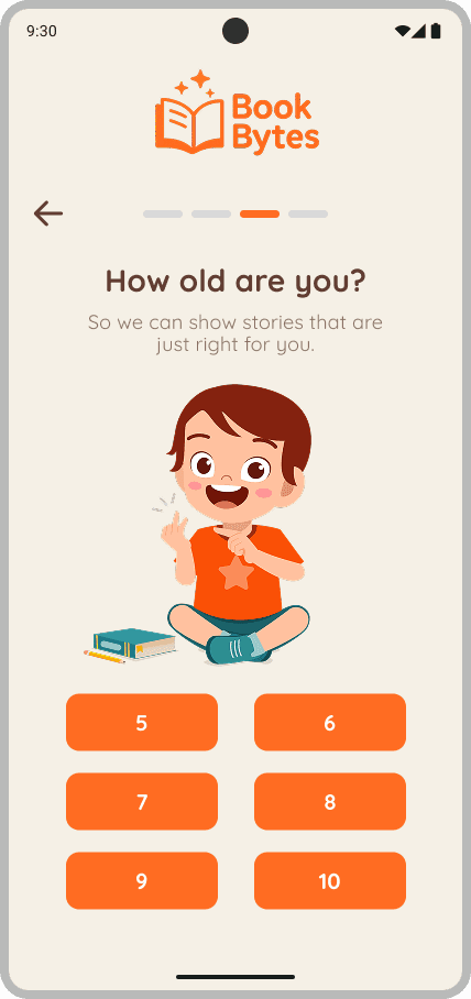
We removed unnecessary barriers so kids could begin reading right away. They could choose an age, pick an avatar, and enter a name in just three simple steps. From there, they launched into stories independently. The experience was intuitive and empowering from the first tap.
⏱️ One-Minute Onboarding
Translating Our Values Into Everyday UI
To support autonomy, we designed UI elements that were visually simple, kid-intuitive, and tailored for early and developing readers ages 5–10.
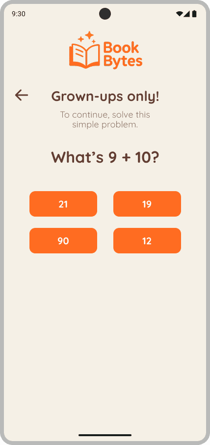
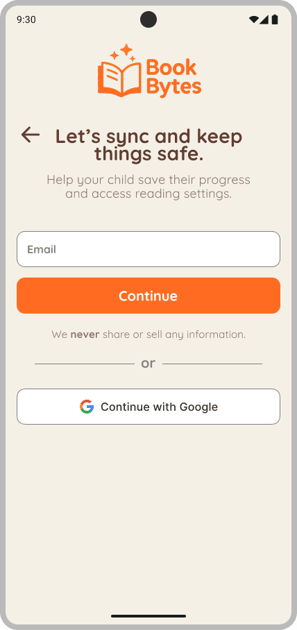
🔐 Optional Grown-Up Gate
A discreet math gate unlocked a separate dashboard where grown-ups could set preferences, view reading activity, and receive quiet alerts. This gate remained hidden from the child’s view, allowing parent oversight without interfering with the kid-led experience.
🎨 Visually Accessible UI
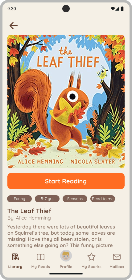
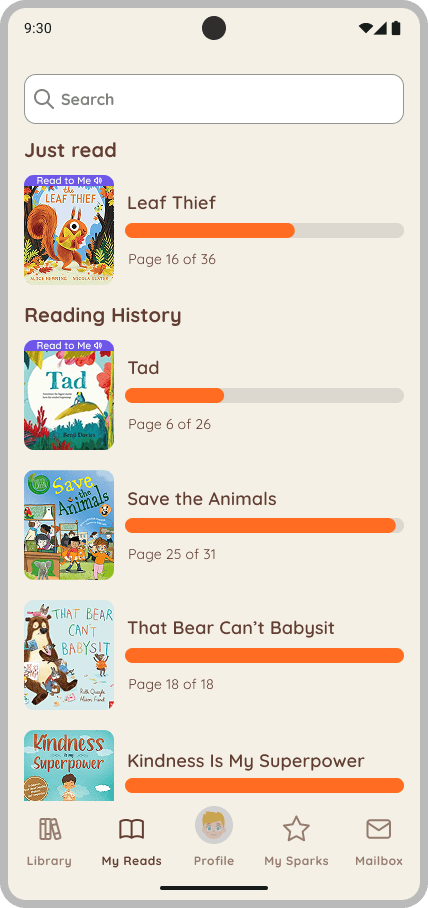
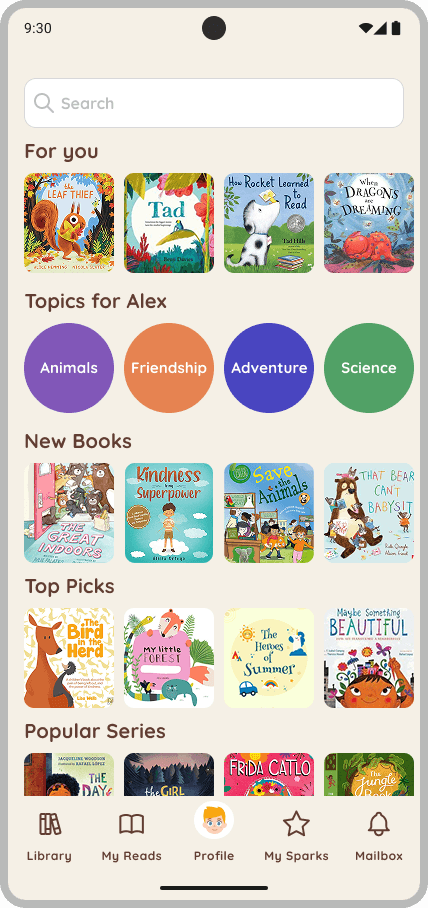
We designed the library to be fully navigable through images, not words. Story cards featured bold, tappable covers arranged visually with minimal copy. Every element was sized and spaced for small hands and short attention spans. Kids could browse and select stories without needing to read.
DESIGNING PARALLEL PATHS
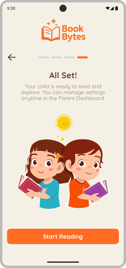
We designed parallel user flows that supported both kids and grown-ups, without crossing paths. Kids could start, explore, and return independently. Grown-ups could quietly check progress without disrupting the child’s experience. Each journey reflected different roles, literacy levels, and emotional needs.
Tap “Get Started” to begin onboarding
Create your profile (name, avatar, age range)
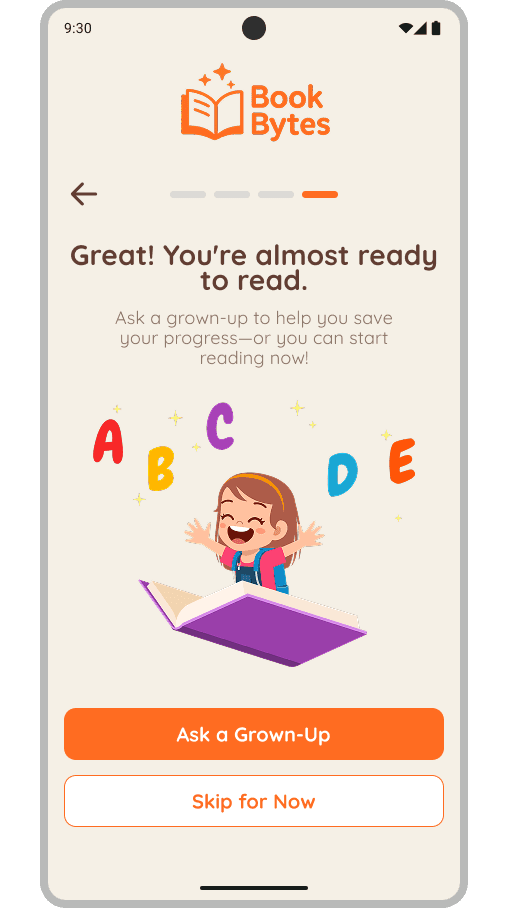
Ask a grown-up to join or skip to continue
Pick a story from the Library
Read to complete your first objective and earn a Story Spark
Celebrate your Spark and badge with a pop-up
Explore your Spark streaks, then return to the Library or My Reads to continue.
👨👩 Parent Flow:
🧒 Child Flow:
Two Journeys, One Goal: Empower Without Hovering
Access gated grown-up setup
Sign in via Google or Email
Set preferences
Return to the child’s reading experience


🧒 Child Flow
👨👩 Parent Flow
DESIGNING WITH REAL-WORLD LIMITS
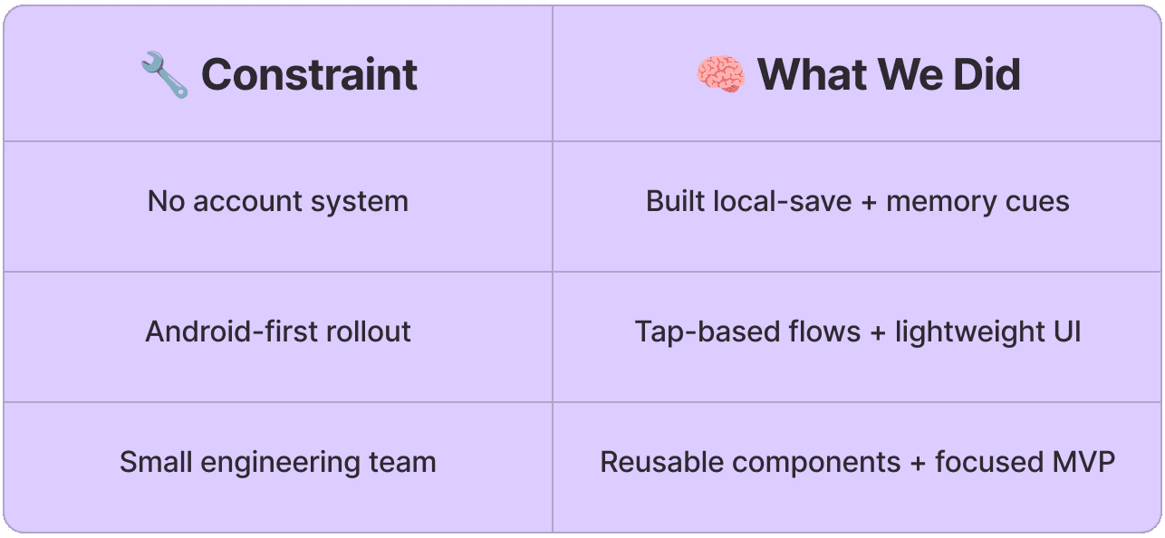
We Couldn’t Control Everything, So We Focused on What Mattered
Our design process wasn’t just about what we wanted to build – it was about what we could build, and how fast we could learn. With limited infrastructure and tight platform constraints, we prioritized features that would directly support kids’ confidence and grown-ups’ passive support.
At the same time, ongoing feedback helped us refine key elements of the experience.

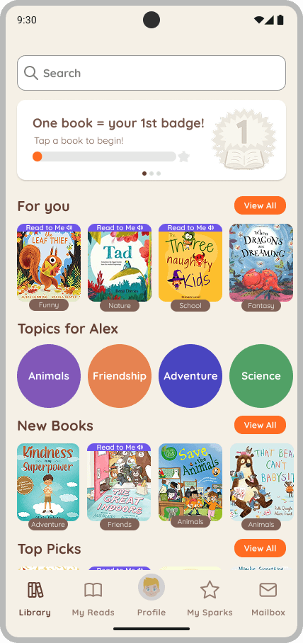
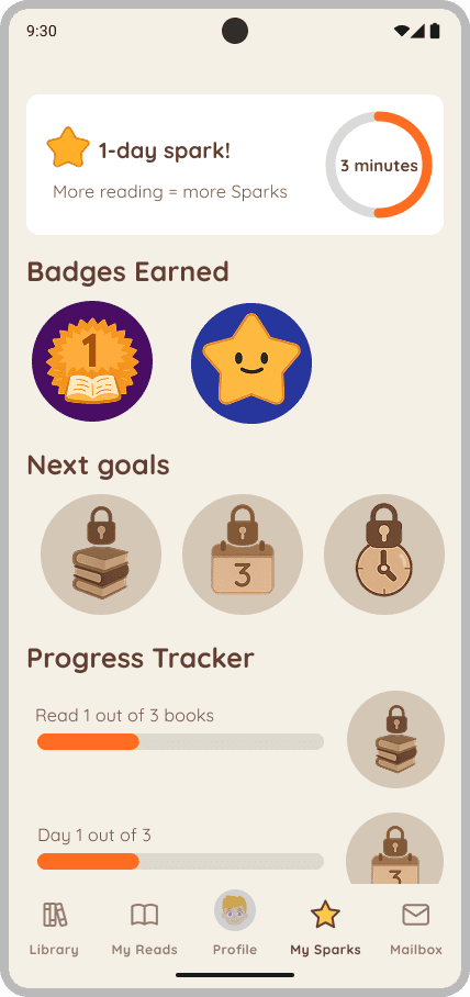
We introduced genre badges (e.g., Funny, Nature), a motivational banner encouraging reading (“One book = your 1st badge!”), and improved book sorting with visual cues. We also redesigned the tracker to clearly indicate how far along kids were in their reading journey. By adding a visible progress bar and milestone markers, we gave kids a simple, visual way to feel encouraged and know exactly what they were working toward.
Minimal feedback and no personalization
Unclear badge progress and feedback
Before
The original Sparks screen had minimal visual feedback, lacked personalization, and offered limited emotional reinforcement. Kids didn’t understand what Sparks were or how they worked.

After
Introduced progress headline to guide expectations
Added genre tags to boost discoverability
After
Added personalized greeting, streaks, and progress indicators
Clear visual indicator of progress and
next reward
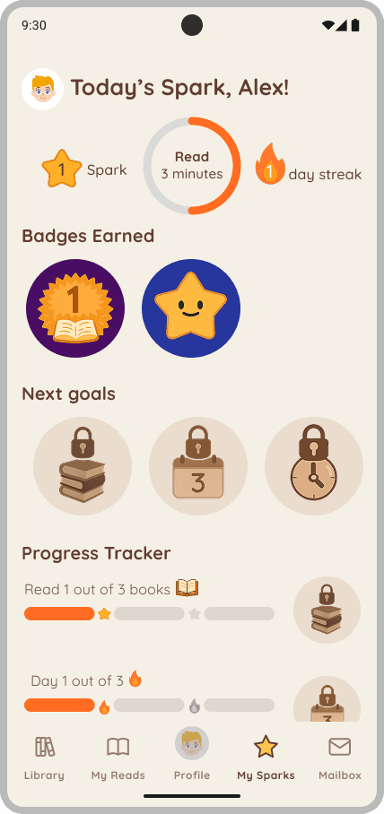
We added a personalized greeting (“Today’s Spark, Alex!”), visual icons for Sparks, reading time, and streaks, as well as clearer badge progress and emotionally supportive language.
Before
The library layout was visually sparse, with no motivational context or genre-specific guidance. At the same time, the progress tracker made it hard for kids to understand how much progress they had made or when they would earn their next badge. The visual cues were subtle and unclear, leading to confusion and a lack of motivation.
No progress cues or badge motivation
No genre tags to guide selection
PROBLEM
Kids Got Lost. Parents Were Locked Out
Book Bytes started as a desktop platform not tailored for young children reading independently. When we explored how early readers (ages 5–10) used it, we noticed a pattern: they arrived excited but quickly disengaged. Many couldn’t recall where they left off, didn’t receive feedback after finishing a story, and struggled to feel a sense of progress.
For this age group, confidence is fragile. Even small barriers can break momentum. Their grown-ups, eager to support, had no tools to stay informed without hovering or taking over — the very things they hoped to avoid.
We asked: How might we design a mobile reading experience that nurtures kids' confidence while keeping grown-ups gently in the loop?
DEV COLLABORATION & MOBILE DESIGN
Designing for Android Meant Thinking in Systems and Working in Sync
Because Book Bytes was launching Android-first, we had to ensure every interaction felt fluid across a wide range of devices. I worked closely with engineers from the beginning – reviewing platform constraints, supporting component logic, and ensuring our designs adapted to real implementation realities.
This wasn’t a one-time handoff. I stayed embedded throughout development to unblock edge cases, clarify interaction logic, and ensure the build matched the intended user experience, even with Android’s device variability.
✅ What My Team and I Delivered:
📲 Android-friendly UI using tap-first flows, scalable layouts, and simplified navigation
🧩 Mini design system with mobile-optimized components (cards, buttons, headers)
📐 Annotated Figma specs with spacing tokens, accessibility guidelines, and state logic
🤝 Collaborative QA and dev check-ins for edge case handling and interaction fidelity

WHAT CHANGED
After simplifying onboarding, drop-off rates decreased by 20%, helping more kids successfully start reading without adult assistance. When we introduced the Sparks system, return rates increased fourfold, showing that children were motivated to come back not for coins, but to celebrate their own progress.
“He was so proud to earn a badge. It wasn’t a game, it was his progress.”
By implementing a local-save system with visual memory cues, we saw a measurable increase in story completion rates. After launching the grown-up dashboard, all 3 tested parents reported feeling informed and reassured, without needing to hover or interrupt their child’s experience.
More Returns. Fewer Drop-Offs. And Parents Who Could Finally Relax.
RESEARCH APPROACH
Grounding Design in Real Behavior, Not Assumptions
We used a small, mixed-methods approach to evaluate both how early and developing readers (ages 5-10) interact with digital stories and how parents support them. Our goal was to uncover friction points, motivation gaps, and opportunities to reinforce autonomy.
Who we spoke to:
👩👧 3 parent interviews about digital reading habits and expectations
🧒 3 play-based usability sessions with kids (ages 6–9)
🧠 1 stakeholder workshop to align constraints and success criteria
4 out of 5 kids tapped icons expecting to “get something”
3 of 5 forgot where they left off
All 3 parents wanted visibility without disrupting their child’s experience
What we found:
FROM INSIGHT TO INTERFACE
Kids Wanted Rewards. Parents Wanted to Disappear.
Our research surfaced distinct patterns in expectations and frustrations. We mapped these into actionable design choices:

This table became a design compass that kept user motivation, clarity, and independence at the forefront.
PROBLEM
Kids Got Lost. Parents Were Locked Out
Book Bytes started as a desktop platform not tailored for young children reading independently. When we explored how early readers (ages 5–10) used it, we noticed a pattern: they arrived excited but quickly disengaged. Many couldn’t recall where they left off, didn’t receive feedback after finishing a story, and struggled to feel a sense of progress.
For this age group, confidence is fragile. Even small barriers can break momentum. Their grown-ups, eager to support, had no tools to stay informed without hovering or taking over — the very things they hoped to avoid.
We asked: How might we design a mobile reading experience that nurtures kids' confidence while keeping grown-ups gently in the loop?
DIFFERENTIATING THE EXPERIENCE
Most Kids’ Apps Reward Clicks. We Chose Confidence.
We audited three early literacy apps — Epic!, Reading.com, and Kids Books — to understand how they motivate children, support autonomy, and balance adult involvement. This competitive analysis helped us identify design patterns to borrow from and intentional gaps to fill.
While all three competitors offered engaging, colorful interfaces and curated content libraries, they often relied on gamified triggers to drive engagement. Book Bytes shares some familiar visual and interaction patterns but was designed with a fundamentally different motivation model: one focused on internal pride and effort, not points or pressure. We deliberately departed from this norm by building motivation around effort-based feedback and visual encouragement rather than simulated progress.
These friction points highlighted clear gaps in the market. We used them to guide design decisions that prioritized autonomy, clarity, and quiet support, rather than replicating gamified systems.
“Sparks felt like a high five, not a test.” – Parent
RESEARCH APPROACH
Grounding Design in Real Behavior, Not Assumptions
We used a small, mixed-methods approach to evaluate both how early and developing readers (ages 5-10) interact with digital stories and how parents support them. Our goal was to uncover friction points, motivation gaps, and opportunities to reinforce autonomy.
Who we spoke to:
👩👧 3 parent interviews about digital reading habits and expectations
🧒 3 play-based usability sessions with kids (ages 6–9)
🧠 1 stakeholder workshop to align constraints and success criteria
4 out of 5 kids tapped icons expecting to “get something”
3 of 5 forgot where they left off
All 3 parents wanted visibility without disrupting their child’s experience
What we found:
DIFFERENTIATING THE EXPERIENCE
Most Kids’ Apps Reward Clicks. We Chose Confidence.
We audited three early literacy apps — Epic!, Reading.com, and Kids Books — to understand how they motivate children, support autonomy, and balance adult involvement. This competitive analysis helped us identify design patterns to borrow from and intentional gaps to fill.
While all three competitors offered engaging, colorful interfaces and curated content libraries, they often relied on gamified triggers to drive engagement. Book Bytes shares some familiar visual and interaction patterns but was designed with a fundamentally different motivation model: one focused on internal pride and effort, not points or pressure. We deliberately departed from this norm by building motivation around effort-based feedback and visual encouragement rather than simulated progress.
These friction points highlighted clear gaps in the market. We used them to guide design decisions that prioritized autonomy, clarity, and quiet support, rather than replicating gamified systems.
FROM INSIGHT TO INTERFACE
Kids Wanted Rewards. Parents Wanted to Disappear.
Our research surfaced distinct patterns in expectations and frustrations. We mapped these into actionable design choices:
This table became a design compass that kept user motivation, clarity, and independence at the forefront.
FEATURE PHILOSPOHY
Motivation That Celebrated Effort, Not Points
Where other apps leaned on stars and streaks, we asked: what if kids didn’t need to win something to feel proud of reading? We wanted kids ages 5–10 to feel proud of progress, not pressured by performance. Each feature was paired with microinteractions that emotionally affirmed effort, not comparison.
Visual feedback tied to milestones, not scores
Recognized effort, not comparison
Encouraged habit, no penalties for breaks
Confetti and sparkle animation guides kids to tap "My Sparks"
✨ My Sparks
🎉 Celebration screen
UX PATTERN
Translating Our Values Into Everyday UI
To support autonomy, we designed UI elements that were visually simple, kid-intuitive, and tailored for early and developing readers ages 5–10.
We designed the library to be fully navigable through images, not words. Story cards featured bold, tappable covers arranged visually with minimal copy. Every element was sized and spaced for small hands and short attention spans. Kids could browse and select stories without needing to read.
We removed unnecessary barriers so kids could begin reading right away. They could choose an age, pick an avatar, and enter a name in just three simple steps. From there, they launched into stories independently. The experience was intuitive and empowering from the first tap.
A discreet math gate unlocked a separate dashboard where grown-ups could set preferences, view reading activity, and receive quiet alerts. This gate remained hidden from the child’s view, allowing parent oversight without interfering with the kid-led experience.
🎨 Visually Accessible UI
⏱️ One-Minute Onboarding
🔐 Optional Grown-Up Gate
PROBLEM
Kids Got Lost. Parents Were Locked Out
Book Bytes started as a desktop platform not tailored for young children reading independently. When we explored how early readers (ages 5–10) used it, we noticed a pattern: they arrived excited but quickly disengaged. Many couldn’t recall where they left off, didn’t receive feedback after finishing a story, and struggled to feel a sense of progress.
For this age group, confidence is fragile. Even small barriers can break momentum. Their grown-ups, eager to support, had no tools to stay informed without hovering or taking over — the very things they hoped to avoid.
We asked: How might we design a mobile reading experience that nurtures kids' confidence while keeping grown-ups gently in the loop?
“Sparks felt like a high five, not a test.” – Parent
FEATURE PHILOSPOHY
Motivation That Celebrated Effort, Not Points
Where other apps leaned on stars and streaks, we asked: what if kids didn’t need to win something to feel proud of reading? We wanted kids ages 5–10 to feel proud of progress, not pressured by performance. Each feature was paired with microinteractions that emotionally affirmed effort, not comparison.
Visual feedback tied to milestones, not scores
Recognized effort, not comparison
Encouraged habit, no penalties for breaks
✨ My Sparks
🎉 Celebration screen
Confetti and sparkle animation guides kids to tap "My Sparks"
UX PATTERN
Translating Our Values Into Everyday UI
To support autonomy, we designed UI elements that were visually simple, kid-intuitive, and tailored for early and developing readers ages 5–10.
We designed the library to be fully navigable through images, not words. Story cards featured bold, tappable covers arranged visually with minimal copy. Every element was sized and spaced for small hands and short attention spans. Kids could browse and select stories without needing to read.
We removed unnecessary barriers so kids could begin reading right away. They could choose an age, pick an avatar, and enter a name in just three simple steps. From there, they launched into stories independently. The experience was intuitive and empowering from the first tap.
A discreet math gate unlocked a separate dashboard where grown-ups could set preferences, view reading activity, and receive quiet alerts. This gate remained hidden from the child’s view, allowing parent oversight without interfering with the kid-led experience.
🎨 Visually Accessible UI
⏱️ One-Minute Onboarding
🔐 Optional Grown-Up Gate
DESIGNING PARALLEL PATHS
Two Journeys, One Goal: Empower Without Hovering
We designed parallel user flows that supported both kids and grown-ups, without crossing paths. Kids could start, explore, and return independently. Grown-ups could quietly check progress without disrupting the child’s experience. Each journey reflected different roles, literacy levels, and emotional needs.
🧒 Child Flow
👨👩 Parent Flow
🧒 Child Flow:
Tap “Get Started” to begin onboarding
Create your profile (name, avatar, age range)
Ask a grown-up to join or skip to continue
Pick a story from the Library
Read to complete your first objective and earn a Story Spark
Celebrate your Spark and badge with a pop-up
Explore your Spark streaks, then return to the Library or My Reads to continue.
👨👩 Parent Flow:
Access gated grown-up setup
Sign in via Google or Email
Set preferences
Return to the child’s reading experience
DESIGNING WITH REAL-WORLD LIMITS
We Couldn’t Control Everything, So We Focused on What Mattered
Our design process wasn’t just about what we wanted to build – it was about what we could build, and how fast we could learn. With limited infrastructure and tight platform constraints, we prioritized features that would directly support kids’ confidence and grown-ups’ passive support.
At the same time, ongoing feedback helped us refine key elements of the experience.
Minimal feedback and no personalization
Added personalized greeting, streaks, and progress indicators
Unclear badge progress and feedback
No genre tags to guide selection
No progress cues or badge motivation
Added genre tags to boost discoverability
Introduced progress headline to guide expectations
Before
Before
After
After
Clear visual indicator of progress and
next reward
The original Sparks screen had minimal visual feedback, lacked personalization, and offered limited emotional reinforcement. Kids didn’t understand what Sparks were or how they worked.
We added a personalized greeting (“Today’s Spark, Alex!”), visual icons for Sparks, reading time, and streaks, as well as clearer badge progress and emotionally supportive language.
The library layout was visually sparse, with no motivational context or genre-specific guidance. At the same time, the progress tracker made it hard for kids to understand how much progress they had made or when they would earn their next badge. The visual cues were subtle and unclear, leading to confusion and a lack of motivation.
We introduced genre badges (e.g., Funny, Nature), a motivational banner encouraging reading (“One book = your 1st badge!”), and improved book sorting with visual cues. We also redesigned the tracker to clearly indicate how far along kids were in their reading journey. By adding a visible progress bar and milestone markers, we gave kids a simple, visual way to feel encouraged and know exactly what they were working toward.
Before
Before
After
After
DEV COLLABORATION & MOBILE DESIGN
Designing for Android Meant Thinking in Systems and Working in Sync
Because Book Bytes was launching Android-first, we had to ensure every interaction felt fluid across a wide range of devices. I worked closely with engineers from the beginning – reviewing platform constraints, supporting component logic, and ensuring our designs adapted to real implementation realities.
This wasn’t a one-time handoff. I stayed embedded throughout development to unblock edge cases, clarify interaction logic, and ensure the build matched the intended user experience, even with Android’s device variability.
✅ What My Team and I Delivered:
📲 Android-friendly UI using tap-first flows, scalable layouts, and simplified navigation
🧩 Mini design system with mobile-optimized components (cards, buttons, headers)
📐 Annotated Figma specs with spacing tokens, accessibility guidelines, and state logic
🤝 Collaborative QA and dev check-ins for edge case handling and interaction fidelity
WHAT CHANGED
More Returns. Fewer Drop-Offs. And Parents Who Could Finally Relax.
After simplifying onboarding, drop-off rates decreased by 20%, helping more kids successfully start reading without adult assistance. When we introduced the Sparks system, return rates increased fourfold, showing that children were motivated to come back not for coins, but to celebrate their own progress.
“He was so proud to earn a badge. It wasn’t a game, it was his progress.”
By implementing a local-save system with visual memory cues, we saw a measurable increase in story completion rates. After launching the grown-up dashboard, all 3 tested parents reported feeling informed and reassured, without needing to hover or interrupt their child’s experience.
RESEARCH APPROACH
We used a small, mixed-methods approach to evaluate both how early and developing readers (ages 5-10) interact with digital stories and how parents support them. Our goal was to uncover friction points, motivation gaps, and opportunities to reinforce autonomy
Who we spoke to:
👩👧 3 parent interviews about digital reading habits and expectations
🧒 3 play-based usability sessions with kids (ages 6–9)
🧠 1 stakeholder workshop to align constraints and success criteria
4 out of 5 kids tapped icons expecting to “get something”
3 of 5 forgot where they left off
All 3 parents wanted visibility without disrupting their child’s experience
What we found:
Grounding Design in Real Behavior, Not Assumptions
FROM INSIGHT TO INTERFACE
Kids Wanted Rewards. Parents Wanted to Disappear.
Our research surfaced distinct patterns in expectations and frustrations. We mapped these into actionable design choices:
This table became a design compass that kept user motivation, clarity, and independence at the forefront.
DEV COLLABORATION & MOBILE DESIGN
Designing for Android Meant Thinking in Systems and Working in Sync
Because Book Bytes was launching Android-first, we had to ensure every interaction felt fluid across a wide range of devices. I worked closely with engineers from the beginning – reviewing platform constraints, supporting component logic, and ensuring our designs adapted to real implementation realities.
This wasn’t a one-time handoff. I stayed embedded throughout development to unblock edge cases, clarify interaction logic, and ensure the build matched the intended user experience, even with Android’s device variability.
✅ What My Team and I Delivered:
📲 Android-friendly UI using tap-first flows, scalable layouts, and simplified navigation
🧩 Mini design system with mobile-optimized components (cards, buttons, headers)
📐 Annotated Figma specs with spacing tokens, accessibility guidelines, and state logic
🤝 Collaborative QA and dev check-ins for edge case handling and interaction fidelity
DIFFERENTIATING THE EXPERIENCE
Most Kids’ Apps Reward Clicks. We Chose Confidence.
We audited three early literacy apps — Epic!, Reading.com, and Kids Books — to understand how they motivate children, support autonomy, and balance adult involvement. This competitive analysis helped us identify design patterns to borrow from and intentional gaps to fill.
While all three competitors offered engaging, colorful interfaces and curated content libraries, they often relied on gamified triggers to drive engagement. Book Bytes shares some familiar visual and interaction patterns but was designed with a fundamentally different motivation model: one focused on internal pride and effort, not points or pressure. We deliberately departed from this norm by building motivation around effort-based feedback and visual encouragement rather than simulated progress.
These friction points highlighted clear gaps in the market. We used them to guide design decisions that prioritized autonomy, clarity, and quiet support, rather than replicating gamified systems.
“Sparks felt like a high five, not a test.” – Parent
WHAT CHANGED
More Returns. Fewer Drop-Offs. And Parents Who Could Finally Relax.
After simplifying onboarding, drop-off rates decreased by 20%, helping more kids successfully start reading without adult assistance. When we introduced the Sparks system, return rates increased fourfold, showing that children were motivated to come back not for coins, but to celebrate their own progress.
“He was so proud to earn a badge. It wasn’t a game, it was his progress.”
By implementing a local-save system with visual memory cues, we saw a measurable increase in story completion rates. After launching the grown-up dashboard, all 3 tested parents reported feeling informed and reassured, without needing to hover or interrupt their child’s experience.
FEATURE PHILOSPOHY
Motivation That Celebrated Effort, Not Points
Where other apps leaned on stars and streaks, we asked: what if kids didn’t need to win something to feel proud of reading? We wanted kids ages 5–10 to feel proud of progress, not pressured by performance. Each feature was paired with microinteractions that emotionally affirmed effort, not comparison.
Confetti and sparkle animation guides kids to tap "My Sparks"
Confetti and sparkle animation guides kids to tap "My Sparks"
🎉 Celebration screen
✨ My Sparks
Visual feedback tied to milestones, not scores
Recognized effort, not comparison
Encouraged habit, no penalties for breaks
UX PATTERN
Translating Our Values Into Everyday UI
To support autonomy, we designed UI elements that were visually simple, kid-intuitive, and tailored for early and developing readers ages 5–10.
We designed the library to be fully navigable through images, not words. Story cards featured bold, tappable covers arranged visually with minimal copy. Every element was sized and spaced for small hands and short attention spans. Kids could browse and select stories without needing to read.
We removed unnecessary barriers so kids could begin reading right away. They could choose an age, pick an avatar, and enter a name in just three simple steps. From there, they launched into stories independently. The experience was intuitive and empowering from the first tap.
A discreet math gate unlocked a separate dashboard where grown-ups could set preferences, view reading activity, and receive quiet alerts. This gate remained hidden from the child’s view, allowing parent oversight without interfering with the kid-led experience.
🎨 Visually Accessible UI
⏱️ One-Minute Onboarding
🔐 Optional Grown-Up Gate
(Contact)
Let’s work together.
DESIGNING PARALLEL PATHS
We designed parallel user flows that supported both kids and grown-ups, without crossing paths. Kids could start, explore, and return independently. Grown-ups could quietly check progress without disrupting the child’s experience. Each journey reflected different roles, literacy levels, and emotional needs.
🧒 Child Flow
👨👩 Parent Flow
Tap “Get Started” to begin onboarding
Create your profile (name, avatar, age range)
Ask a grown-up to join or skip to continue
Pick a story from the Library
Read to complete your first objective and earn a Story Spark
Celebrate your Spark and badge with a pop-up
Explore your Spark streaks, then return to the Library or My Reads to continue.
Access gated grown-up setup
Sign in via Google or Email
Set preferences
Return to the child’s reading experience
Two Journeys, One Goal: Empower Without Hovering
👨👩 Parent Flow:
(Contact)
Let’s work together.
(Contact)
Let’s work together.
DEV COLLABORATION & MOBILE DESIGN
Designing for Android Meant Thinking in Systems and Working in Sync
Because Book Bytes was launching Android-first, we had to ensure every interaction felt fluid across a wide range of devices. I worked closely with engineers from the beginning – reviewing platform constraints, supporting component logic, and ensuring our designs adapted to real implementation realities.
This wasn’t a one-time handoff. I stayed embedded throughout development to unblock edge cases, clarify interaction logic, and ensure the build matched the intended user experience, even with Android’s device variability.
✅ What My Team and I Delivered:
📲 Android-friendly UI using tap-first flows, scalable layouts, and simplified navigation
🧩 Mini design system with mobile-optimized components (cards, buttons, headers)
📐 Annotated Figma specs with spacing tokens, accessibility guidelines, and state logic
🤝 Collaborative QA and dev check-ins for edge case handling and interaction fidelity
WHAT CHANGED
More Returns. Fewer Drop-Offs. And Parents Who Could Finally Relax.
After simplifying onboarding, drop-off rates decreased by 20%, helping more kids successfully start reading without adult assistance. When we introduced the Sparks system, return rates increased fourfold, showing that children were motivated to come back not for coins, but to celebrate their own progress.
“He was so proud to earn a badge. It wasn’t a game, it was his progress.”
By implementing a local-save system with visual memory cues, we saw a measurable increase in story completion rates. After launching the grown-up dashboard, all 3 tested parents reported feeling informed and reassured, without needing to hover or interrupt their child’s experience.
(Contact)
Let’s work together.
(Contact)
Let’s work together.
DESIGNING WITH REAL-WORLD LIMITS
We Couldn’t Control Everything, So We Focused on What Mattered
Our design process wasn’t just about what we wanted to build – it was about what we could build, and how fast we could learn. With limited infrastructure and tight platform constraints, we prioritized features that would directly support kids’ confidence and grown-ups’ passive support.
At the same time, ongoing feedback helped us refine key elements of the experience.
Before
The original Sparks screen had minimal visual feedback, lacked personalization, and offered limited emotional reinforcement. Kids didn’t understand what Sparks were or how they worked.
Minimal feedback and no personalization
Unclear badge progress and feedback
After
We added a personalized greeting (“Today’s Spark, Alex!”), visual icons for Sparks, reading time, and streaks, as well as clearer badge progress and emotionally supportive language.
Clear visual indicator of progress and next reward
Added personalized greeting, streaks, and progress indicators
Before
No progress cues or badge motivation
No genre tags to guide selection
The library layout was visually sparse, with no motivational context or genre-specific guidance. At the same time, the progress tracker made it hard for kids to understand how much progress they had made or when they would earn their next badge. The visual cues were subtle and unclear, leading to confusion and a lack of motivation.
After
We introduced genre badges (e.g., Funny, Nature), a motivational banner encouraging reading (“One book = your 1st badge!”), and improved book sorting with visual cues. We also redesigned the tracker to clearly indicate how far along kids were in their reading journey. By adding a visible progress bar and milestone markers, we gave kids a simple, visual way to feel encouraged and know exactly what they were working toward.
Introduced progress headline to guide expectations
Added genre tags to boost discoverability